

We may earn a commission when you buy through links on this page, at no extra cost to you. Learn more.
Champagne color is a pale, warm gold with soft beige or peach undertones, and it takes its name from the sparkling wine made in the Champagne region of northeastern France. Young champagne looks light straw, while older bottles drift toward deeper gold. The shade is one of the most recognizable colors in fashion, interior design and event planning.
If you have ever tried to match a paint chip, a bridesmaid dress or a table linen to a glass of bubbly, you have run into the same question: what exactly is champagne color? This guide explains where the shade comes from, how it changes as the wine ages, and how to describe it accurately whether you are pouring a glass or picking a palette.
What champagne color looks like
Champagne color sits between cream, beige and pale gold. It has enough warmth to feel rich but not so much saturation that it reads as yellow. Most people place it just lighter than gold and a touch warmer than ivory.
Design references describe it as a desaturated yellow-beige with faint pink or peach tones. That subtle warmth is why it works so well next to blush and rose shades. The color is quieter than metallic gold, which is bold and reflective, so it is often used where a softer luxury feel is wanted.
Why the wine has this color
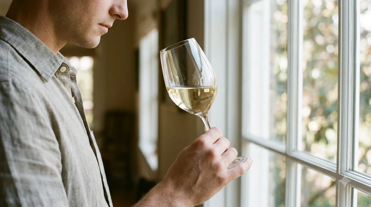
The color of a finished champagne comes mostly from winemaking choices rather than from the grapes alone. Champagne is made from Chardonnay, Pinot noir and Pinot Meunier, as the Wine Folly Champagne guide also lists, and that guide adds that the most treasured bottles age at least three years. Even when the grapes are dark-skinned, the juice is pressed off quickly so that very little color leaches out of the skins. According to the encyclopedia entry on champagne, the process minimizes contact with the skins, which is why most champagne looks light even when red grapes are involved.
Once the wine is bottled for its second fermentation, it ages on its lees, the dead yeast cells that settle in the bottle. Over months and years, that contact adds depth and gives the wine a gradually warmer color. A young non-vintage bottle usually shows a pale straw tone, while a bottle that has aged for many years on its lees can turn golden and, in extreme cases, amber.
Rosé champagne is a separate case. Its blush color comes from a small amount of red wine added to the blend or from brief skin contact during pressing, and it is usually described as pink or salmon rather than gold.
How color changes with style and age
Champagne color is not one fixed shade. Style, grape mix and age all move it along a range from silver-white to deep gold. The table below gives a practical guide for matching what you see in the glass to a name you can use in a design brief or a conversation.
| Style | Typical color | What drives it |
|---|---|---|
| Non-vintage Brut | Pale straw with green-gold tint | Young, short time on lees |
| Blanc de Blancs (all Chardonnay) | Light straw to pale gold | Chardonnay tends toward a lighter, greener shade |
| Blanc de Noirs (red grapes, no skin contact) | Silvery white to pale gold | Dark grapes pressed quickly, so the color stays pale |
| Vintage or long-aged | Deeper gold, sometimes amber | Extended time on lees deepens the wine |
| Rosé | Salmon, pink or blush | Brief skin contact or a small amount of red wine |
Tip: Hold the glass against a white background in natural light. The base tone is easier to judge there than under warm restaurant lighting, which pushes every champagne toward gold.
Champagne color versus gold, cream and blush
People often mix champagne color up with gold, cream or blush, so it helps to know where each one stops. Gold is saturated and metallic, and it has a strong yellow core. Cream is closer to white with a faint yellow. Blush is pink. Champagne sits in the middle: lighter than gold, warmer than cream and less pink than blush.
In practice, this is why champagne is often used as a neutral. It pairs well with ivory, sage and soft grey, and it can ground a brighter accent without competing with it. Many style guides suggest it as a substitute when gold feels too loud.
How lighting and photos change champagne color
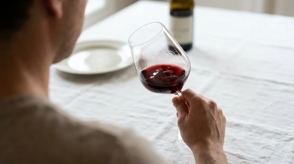
Champagne color is one of the shades most affected by light. Under warm incandescent bulbs it can look almost orange, while under cool daylight it looks closer to pale silver. Camera white balance adds another layer, so a photo of a bottle may not match the shade you saw in person. Anyone choosing a color from a screen should compare a physical sample in the room where it will be used.
The same effect applies to the wine itself. Bubbles scatter light and make a glass look slightly brighter than the liquid really is. Serving in a clear flute or coupe shows the true depth better than a tinted or heavily cut glass, which can exaggerate the gold.
For printed materials, the warm undertone is easy to lose. Designers often shift champagne toward a touch more yellow for print and check the result on paper before committing, because a shade that looks elegant on a monitor can print flat or greyish.
Using champagne color for events and décor
Event planners use champagne as a base for weddings, anniversaries and holiday tables because it photographs warmly and does not clash with most skin tones. A common approach is to pick champagne for the largest surfaces, such as linens or drapes, then add a deeper accent like burgundy or forest green for contrast.
For a fuller celebration theme, pair the base color with the drinks themselves. A champagne cocktail keeps the same golden glow in the glass, so the table reads as one palette rather than separate pieces.
How to describe champagne color accurately
When you need to name the color in a written brief, be specific about the depth. Words like pale gold, straw or silver-gold are more useful than a generic yellow. If you are comparing it with a wine shade, it is also helpful to note the style, because a Blanc de Noirs and a vintage bottle can look very different in the same flute.
For more on how wine color relates to grape and style, the wine types guide covers the main families, and the rose color page explains how the blush end of the range differs.
Frequently Asked Questions
Is champagne color the same as gold?
No. Champagne color is lighter and softer than gold. Gold is saturated and metallic, while champagne sits closer to cream and pale beige with a warm, subtle yellow undertone.
Why is champagne color not always golden?
Most champagne is pressed quickly and aged for a short time, so young bottles look straw or silvery. Only longer aging on the lees pushes the wine toward a deeper gold.
Does rosé champagne have champagne color?
Rosé champagne is pink or salmon, so it falls outside the classic champagne color. The name still applies to the wine’s style, but the visible shade is blush rather than gold.
What colors go well with champagne color?
Ivory, sage, soft grey and deep green are common partners. Burgundy and navy add contrast, and blush or dusty rose keeps the palette warm without making it heavy.
Champagne color is best understood as a family of pale golds rather than one exact shade. Whether you are describing a glass of bubbly or planning a room, naming the depth and undertone makes the color easy to match. For a simple way to start a palette, begin with champagne as the base and add one stronger accent.
More in Wine Types & Grapes
 Zinfandel Sugar Content: Dry Red vs. White Zinfandel GramsUpdated Nov 21, 2026
 Best Zinfandel Substitute Options for Sipping and CookingUpdated Nov 21, 2026
 Zweigelt Food Pairing: Best Dishes, Cheeses, and Serving TipsUpdated Nov 21, 2026
 Zinfandel Tannins Explained: How Structure Shapes Every BottleUpdated Nov 21, 2026
 Zinfandel Sweetness Level: Dry Red vs. Sweet White Zin ExplainedUpdated Nov 21, 2026
 Xinomavro Food Pairing: Best Dishes, Styles, and Serving TipsUpdated Nov 21, 2026